Covers sell books. But in the case of Hillary Clinton’s memoir What Happened, you can’t help thinking that the book’s sales in the UK are despite the jacket treatment, not because of it. Whereas the US jacket oozes the gravitas you expect from the woman who stood up to Donald Trump, the UK jacket has all the power of a shrugged “meh”.
The book is published worldwide by Simon & Schuster, and the company’s US division opted for bold lettering on a white-and-blue background (incorporating the Democrats’ traditional colour). The design screams its serious credentials: this, it tells the reader, is The Book by the woman everyone expected to be a shoo-in for the Oval Office, a woman defined by her service in husband Bill’s and Barack Obama’s administrations.
It is a cover worthy of the memoir that has a place in academic libraries. Weight is given to the title, What Happened. A simple statement, it hangs above Clinton’s name, reflecting the question on the lips of everyone who awoke on 9 November to find Donald Trump was soon to get access to the nuclear codes.
But the UK cover … where do you begin? Any sense that Clinton is laying it on the line, or even offering answers, is washed away by a design so hackneyed it even has a generic politico-at-a-rally headshot, albeit one in which Hillary’s firm-lipped expression is reminiscent of the look your mum gave you the first time you barrelled home drunk. Not only that, but the background colour is as pallid as one of her pant suits, and the title – a question on the lips of everyone in the UK as well as the US – is squirrelled away beneath her name.
When I ask, “What happened?” her publisher responds with a terse refusal to comment. But it raises the question: why did the Americans get it right and the British so wrong when UK book design is supposedly the envy of the world?
One jacket designer, Stuart Bache, says the gulf between British and US design has narrowed in recent years, especially in literary fiction. Traditionally, US design tended towards literal interpretation, driven, Bache believes, by the complexity of the US market: the image that motivates readers in southern California to pick up a copy of a book is likely to be different to what appeals to readers in South Carolina. As a result, US jackets have tended to appeal to the lowest common denominator, and that does not make for good design.
“It’s a complicated [market], so the design becomes simpler and focuses on broader appeal,” Bache says. “However, things have shifted in the last few years,” he adds. “There are a lot more similarities now, particularly in literary novels where the luxury of creating much more elegant, beautiful covers has been afforded to the books.”
The designer and illustrator Neil Gower believes US designers have upped their game because of the explosion in digital books. “I think ebooks and the internet have definitely focused publishers’ attention on making books beautiful, covetable objects again,” he says. Publishers on both sides of the Atlantic realise that to justify the cost of a hardback, a book needs to be more than a container of words. It has to be an object of beauty in its own right, he says.

Aided by advances in print technology, British and US designers are playing with things such as spot-varnishes, embossing, debossing and foils to make books physically arresting, tactile objects. Gower says: “The brief for my own book, As Kingfishers Catch Fire – in collaboration with Alex Preston – was to produce the most beautiful book of 2017, and the attention to detail extended way beyond the cover to the endpapers, the quality of the paper and colour-plates. I feel privileged to be designing books in this era.”
Similar ideas are appearing on both sides of the Atlantic: hand-drawn typography, bold colours and a handcrafted feel to the illustrations. Images are de rigueur. And, says Jason Arthur, a publishing director based in the UK at Penguin Random House, US designers are leaping at the creative opportunities. “I used to think British book design was the best in the world and that the Americans were 20 years behind,” he says. “But that has changed in the last two or three years, especially with fiction from the US that put our designs to shame.”
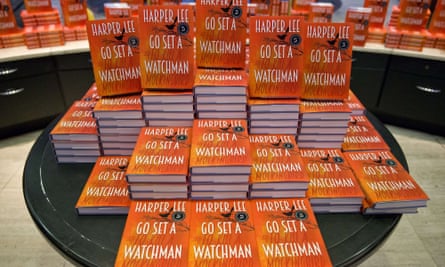
Arthur knows what he is talking about. His division of Penguin Random House has been responsible for jackets that have left US editions looking dowdy. A case in point was the UK edition of Harper Lee’s late bloomer Go Set a Watchman, which cleverly integrated the title of To Kill a Mockingbird, with a nod to 50s film posters. It veers on the right side of nostalgia. Not so the US cover by Jarrod Taylor. Drab blue with the Caterina typeface – which, despite the retro feel, is less than 20 years old – it is as appealing as a book gathering dust at the back of the school library. It falls on the wrong side of that nostalgia line. One designer, Paul Sahre, told Wired the cover was “a pastiche and a parody”.

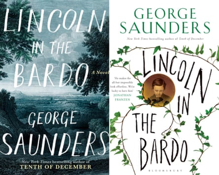
One book a US designer got right was George Saunders’ novel Lincoln in the Bardo, says Arthur. The hardback, designed by Barbara M Bachman, features a pastoral cover illustration that Saunders himself praised for its “feeling of mystery”. “It wasn’t just a picture of Lincoln,” he told New York magazine’s Vulture. “I see it as being at dusk, and I thought it picked up the feeling of America in the mid-19th century – half pastoral, half burgeoning industrial.”
Saunders didn’t say what he thought of the UK cover, but one can’t help thinking he would have been disappointed. With its spindle of branches and portrait of Abe Lincoln’s son, it reveals little about the book, but plenty about the present obsession of British designers with William Morris – typified by Sarah Perry’s bestselling The Essex Serpent.
That a jacket should reveal something about the content is often the beef authors have with designs, which explains why many seem more relaxed with their US covers than their UK ones. By telling the story – or at least hinting at it – there is less likelihood the jacket will be interchangeable with everything else in their section of WH Smith.
Mick Herron, whose Jackson Lamb novels were first published by Soho in the US before becoming a word-of-mouth hit here, says the US design clearly positions the books for US readers whose knowledge of British spies might only extend to James Bond. “The two recent ones have a sniper-scope emblem, which doesn’t actually reflect anything in the content, but gets a basic message across,” says the Newcastle-born writer. “I don’t really get consulted at all,” he adds, and is happy to leave it to his publisher. “I don’t have much of an eye for that sort of thing.”

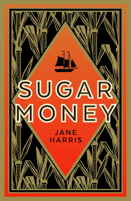
Not everyone is so laid-back about covers, and with good reason. As the novelist Jane Harris explains, gender can make a huge difference to how a book is packaged on both sides of the Atlantic. “If you are a woman writer, they seem to always want to put a woman on the cover,” she says. So determined was she that this should not happen to her latest novel, Sugar Money – about two brothers sent to Grenada to reclaim 42 slaves for their French master – that when she finished the final chapter, she tweeted: “Put a woman on the cover of this, suckers.”
Her publisher, Faber, delivered: in the UK the books has an abstract design of sugar cane in eye-popping black, red and gold. But Harris is not hopeful the design will be taken up in the US. “They seem to be wary of anything that is in any way abstract, or risks being confusing,” she says. “If you are writing about slavery, they will want to put a cliched image on the cover.”
In recent years in the US and UK, the people with most influence over a book jacket have been those who choose stock for supermarkets and chains such as Waterstones and WH Smith. A few years ago, a publisher at one of the “big three” houses (Penguin Random House, Hachette and HarperCollins) told me that they had presented a new book at a meeting with the buyer from a well-known retailer. An order from the chain could propel the book into the Top 10, but there was a problem: they hated the jacket. The publisher returned to her art department and commissioned a second design. Again, the buyer rejected it – the cover was still wrong. In all, the publisher had the jacket redesigned five times, until, as a joke, she took the original cover back to the buyer, who asked: “Why didn’t you bring me this first? I love it.”
The story is telling of publishers’ secret contempt for the retailers they must woo. Whatever creative inspiration designers may have, what matters more to some retailers is that the average punter will know what “type” of book they are getting, hence the number of books with Jack Reacher-style silhouetted men on the cover, or Fifty Shades wannabes with muted pictures of fishnets and ties.
This tendency to avoid originality does backfire. One novelist, who asked not to be named, complains bitterly that a mutilated doll on the cover of her book in the US killed her career there. “It had no direct relevance to the content, and suggested the story is far creepier than in fact it was,” she says. “I was dropped by the publisher because the book didn’t sell. I can’t help feeling the cover did the book no favours and was actually off-putting.”
Her situation is becoming less common, says Jason Arthur, and he believes that a new generation of US designers is producing world-beating work. “There is a younger generation coming through who are more outward-looking in inspiration,” he says. These designers are as inspired by gaming and film as they are books, and their work reflects this broadening of viewpoints.
And, he adds, this improvement means that more US designs are making it into British bookshops. He cites The Readymade Thief by Augustus Rose as one example. “We saw the US cover and liked it, and came up with 20 different jacket designs of our own, but the American jacket was the best, so we decided to go with that.” It’s just a pity that no one thought this about Clinton’s memoir.

Comments (…)
Sign in or create your Guardian account to join the discussion