
How Much Higher Will Silver Go: See What The 50-Year Long-Term Silver Chart Reveals
As the SILVER BULL MARKET continues on its ever-increasing upward trend, what does the 50-year long-term silver chart reveal?? Let’s just say, some of the indicators are pointing to much higher prices. And, if we include the lousy economic and financial fundamentals being propped up by massive Fed and central bank stimulus, it seems like there will be even more investor demand for gold and silver.
Last night during the Asian trading on my SRSrocco Report Twitter Feed, I posted this intra-day silver chart showing that it was getting ready to BREAKOUT through a new Ascending Triangle Formation. Just like in several Ascending Triangle formations this past month, it did exactly what I anticipated.
Looks like #SILVER setting up another INTRADAY Breakout.
— SRSrocco Report (@SRSroccoReport) August 6, 2020
Another ASCENDING TRIANGLE formation looks to form another BREAKOUT.
Heading for the next TARGET LEVEL of $27.50... and likely higher. pic.twitter.com/fvNS3A4qNX
As you can see at the bottom of the Twitter Box, there are a lot more people responding to my Tweets.I truly appreciate all the feedback and new Twitter followers. Anyhow, as silver broke through the Ascending Triangle Formation, it surged higher.
Then early this morning, I put out another Tweet showing that after silver broke through $27.50, the Long-Term Resistance Level that I have shown on many Monthly Charts, guess what it did? That’s right… it corrected back and retested the $27.50 level before moving higher. When I was watching the Day Trading Markets, I saw this happen OVER, and OVER, and OVER again.
SILVER RALLY CONTINUES...
— SRSrocco Report (@SRSroccoReport) August 6, 2020
After #Silver BROKE out of the ASCENDING TRIANGLE, it pushed through the next target level of $27.50.
Then nearly reaching $28, Silver reversed and retested the long-term $27.50 Monthly Level, before moving higher.
What an interesting day... pic.twitter.com/bFfRqehfVR
It was essential that silver retested that $27.50 level before moving higher.So… WHAT’s NEXT???LOL… I don’t think anyone in the precious metals market had any idea that we would see this type of rapid price movement. But, here we are.
So, what does the 50-Year long-term silver chart show?? This is a QUARTERLY CHART, which represents three months of trading in each candlestick. If we look at when the silver price broke through its long-term $15 RESISTANCE LEVEL, you will see the corresponding MACD Indicator figures.
(Click on image to enlarge)
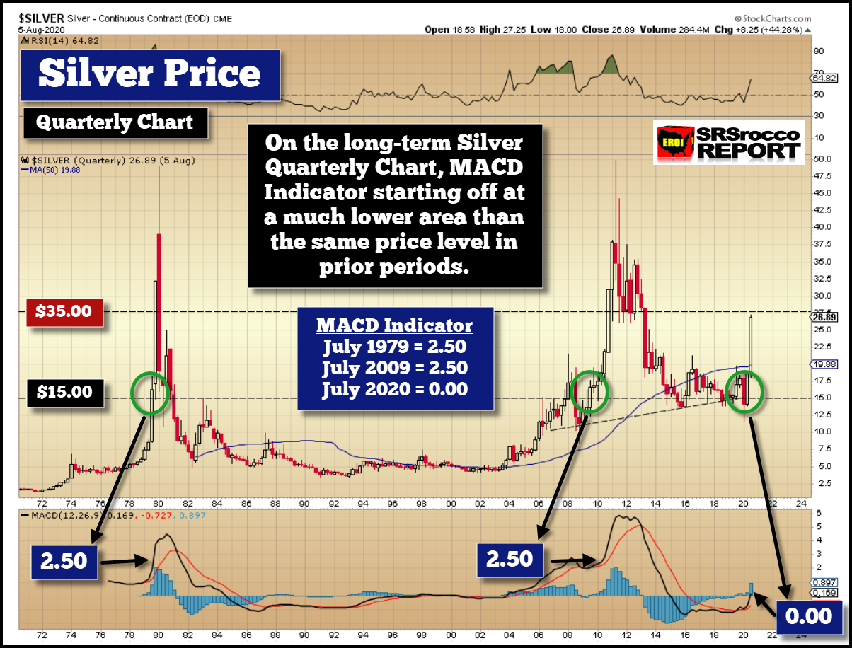
I am going to simplify this for those who don’t know much about TA – Technical Analysis. When silver broke through the $15 resistance level in July 1979 and in July 2009, the MACD indicator reading was about 2.50. While silver broke through the $15 level in early 2008, the MACD indicator was also 2.50.
However, because silver has been consolidating over the past seven years, the MACD Level has been extremely low. You can see a negative level from 2015 until early 2020. But, as silver shot above the $15 level in the second quarter (Q2 = July on this chart), the MACD indicator level was a PHAT ZERO.
Thus, silver is now SETUP to move much higher than either the 1978-1980 or 2009-2011 Bull Markets. Also, it seems to me that on the 50-Year Quarterly Chart, that the real SILVER BULL MARKET Starts at above $27.50.Furthermore, If you look at the very top of the chart, you will see the RSI (Relative Strength) Indicator. The current silver price in the Quarterly Chart is nowhere near being OVERBOUGHT, as it was in the previous periods.
So, we just may see $30+ or even $35 before a correction. If silver does go up to $30-$35, then it makes sense that the new SUPPORT LEVEL will be at $27.50.
I will do another SILVER PRICE UPDATE this weekend when the new COT REPORT is published.
Setting The Record Straight About Silver Fundamentals & Technical Analysis
I wanted to conclude this post with a rebuttal to a Twitter follower who replied in response to my Ascending Triangle Breakout Tweet:
SILVER RALLY CONTINUES...
— SRSrocco Report (@SRSroccoReport) August 6, 2020
After #Silver BROKE out of the ASCENDING TRIANGLE, it pushed through the next target level of $27.50.
Then nearly reaching $28, Silver reversed and retested the long-term $27.50 Monthly Level, before moving higher.
What an interesting day... pic.twitter.com/bFfRqehfVR
Daniel believes that the Technical Analysis and charting is, in his own words, “CHARTALIST NONSENSE.”While everyone can and will have their own opinions, there are a few things I would like to point out. Because most Conservatives and liberals will likely go to their graves believing their political views are 100% correct, this is the same with individuals on the subject of Technical Analysis.
There is no coincidence that silver enjoyed BREAKOUTS at key levels I pointed out in charts for the past several years. These key levels have nothing to do with Precious Metals Derivatives or the Asian-Chinese Market. These technical levels are the foundation for all TRADING and INVESTING in the markets. You either follow them, or you ignore them at your peril.
So, all I am doing is showing what the TRADERS are looking at, and why the silver price is behaving a certain way instead of random prices fluctuating on the Kitco.com quote ticker.
In regards to Daniel’s comment that “Asian entities taking control of the market by insisting on physical delivery,” is more HYPE than REALITY. I will explain. This type of “Chinese-Asian Gold Backed” BRO-MANCE by many in the Alt-Media sounds nice on paper, in blog posts, and on lots of Conspiracy Theorist Videos, but I can assure you that China is in much more grave danger than a Gold-Backed Yuan would solve.
The ALT-MEDIA needs to reflect a bit on their BRO-MANCE, with China setting the world free from the Western Bullion Banks supposed Gold-Silver Paper control. China isn’t going to change the gold market. PEAK OIL and the FALLING EROI are changing the gold and silver market as we speak. Still, unfortunately, those who continue to follow superficial analysis by many of the precious metals analysts are going to miss the bigger picture.
I will be providing more info on this in future articles and videos.
How to support the official Rocco site: I would also like to thank those foundation supporters, who have chosen to become a member by making donations through PayPal to further the research and ...
more

