
How Europe’s Underperformance May Hurt Gold
Gold most recently dipped below $1800 and it’ll be testing new lows in the days and weeks ahead. How does the European connection place even further downward pressure on the precious metals?
We’ve recently written quite a bit about the importance of the EUR/USD pair and how the precious metals are tied to it, and we’ll delve further into this matter today, but before we do, let’s take a look at mining stocks, using the GDX ETF as a proxy for them.
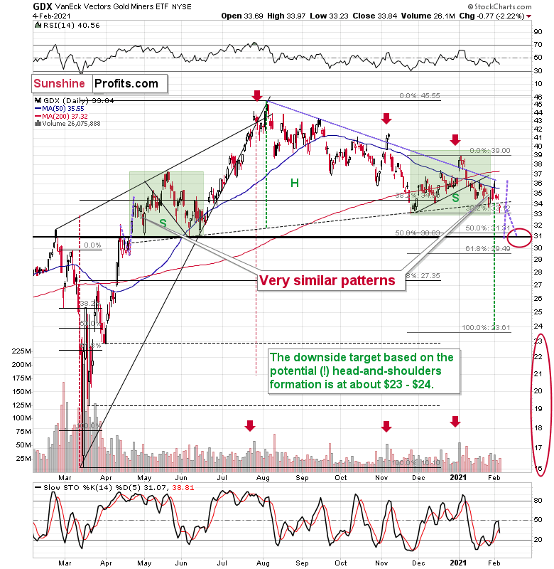
Figure 1 – VanEck Vectors Gold Miners ETF (GDX)
Miners declined decisively yesterday (Feb. 4), and they once again closed below the neck level of the head-and-shoulders pattern. The final pause before the slide seems to be over.
Are miners weak right now? Of course, they are weak. It was not only silver that got attention recently, but also silver stocks. The GDX ETF is mostly based on gold stocks, but still, silver miners’ performance still affects it. And… GDX is still trading relatively close to the yearly lows. Silver moved a bit above its 2020 highs – did miners do that as well? Absolutely not, they were only able to trigger a tiny move higher.
And based on Wednesday’s decline, most of the recent run-up was already erased.
Interestingly, the most recent move higher only made the similarity of this shoulder portion of the bearish head-and-shoulders pattern to the left shoulder (figure 2 - both marked with green) bigger. This means that when the GDX breaks below the neck level of the pattern in a decisive way, the implications are likely to be extremely bearish for the next several weeks or months.
Due to the uncanny similarity between the two green rectangles, I decided to check what happens if this mirror-similarity continues. I used purple, dashed lines for that. There were two important short-term price swings in April 2020 – one shows the size of the correction and one is a near-vertical move higher.
Copying these price moves (purple lines) to the current situation, we get a scenario in which GDX (mining stocks) moves to about $31 and then comes back up to about $34. This would be in perfect tune with what I wrote previously. After breaking below the head-and-shoulders pattern, gold miners would then be likely to verify this breakdown by moving back up to the neck level of the pattern. Then, we would likely see another powerful slide – perhaps to at least $24.
All in all, it seems that silver’s run-up was just a temporary phenomenon and the next big medium-term move in the precious metals and mining stocks is going to be to the downside.
There’s something more about those big head-and-shoulders patterns that you should know, and it’s not something minor.
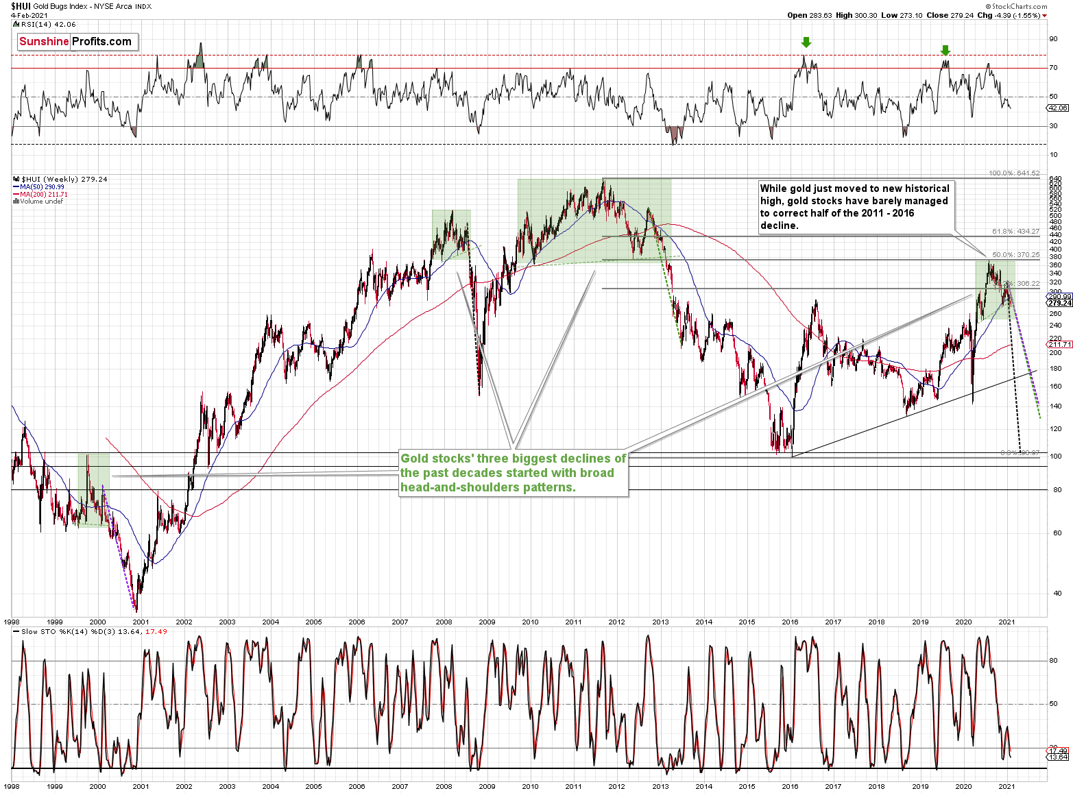
Figure 2
The thing is – the three of the biggest declines in the mining stocks (I’m using the HUI Index as a proxy here), all started with broad, multi-month head-and-shoulders patterns.
And now we’re seeing this pattern all over again. The above picture should make it clear why I was putting “at least” in bold, when describing the targets based on the head-and-shoulders patterns.
In all three cases, the size of the decline exceeded the size of the head of the pattern. This means that the $24 target on the GDX ETF chart is likely conservative.
Can we see gold stocks as low as we saw them last year? Yes.
Can we see gold stocks even lower than at their 2020 lows? Again, yes.
Of course, it’s far from being a sure bet, but the above chart shows that it’s not irrational to expect these kind of price levels before the final bottom is reached.
The dashed lines starting at the 2020 top are copies of sizes of the declines that started from the right shoulder of the previous patterns. If things develop as they did in 2000 and 2012-2013, gold stocks are likely to bottom close to their 2020 high. However, if they develop like in 2008 (which might be the case, given the extremely high participation of the investment public in the stock market and other markets), gold stocks could re-test (or break slightly below) their 2016 low.
I know, I know, this seems too unreal to be true… But wasn’t the same said about silver moving below its 2015 bottom in 2020? And yet, it happened.
Having said that, let’s go to Europe and take a look at the markets from the fundamental point of view.
Down Where We Belong
For weeks, I’ve been warning that the Eurozone economy and the EUR/USD were on a collision course. And with Europe’s fundamental underperformance accelerating at a drastic pace, we may have just had an impact.
On Feb. 4, the EUR/USD hit its lowest level since Nov. 30.
Please see below:
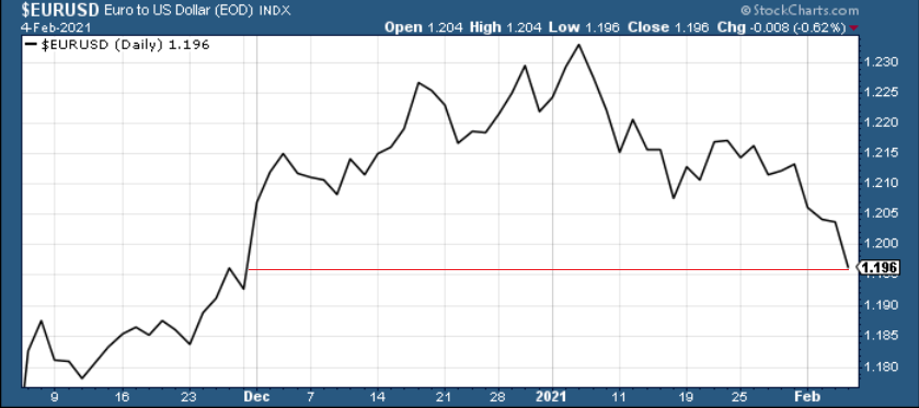
Figure 3
Along for the ride, the EUR/USD’s pain has not been the PMs gain. Because of their strong correlation, it’s no surprise that the euro’s downfall is making waves across the precious metals’ market.
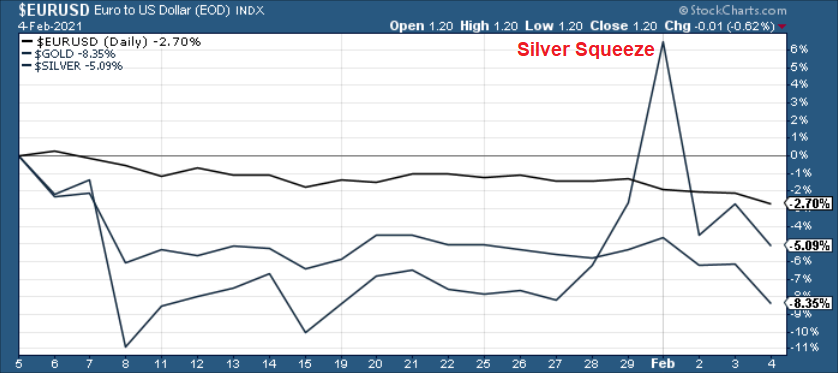
Figure 4
Foretelling the decline, I warned that the EUR/GBP was about to crack. And given the EUR/USD’s strong correlation with the EUR/GBP, the latter’s collapse was an early warning sign.
On Monday (Jan. 25), I wrote that Janet Yellen’s pledge to “act big” on the next coronavirus relief package ushered the EUR/GBP back above critical support.
However, on Tuesday (Jan. 26), the key level broke again.
Please see below:
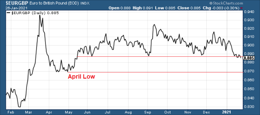
Figure 5
More importantly, though, a break in the EUR/GBP could be an early warning sign of a forthcoming break in the EUR/USD.
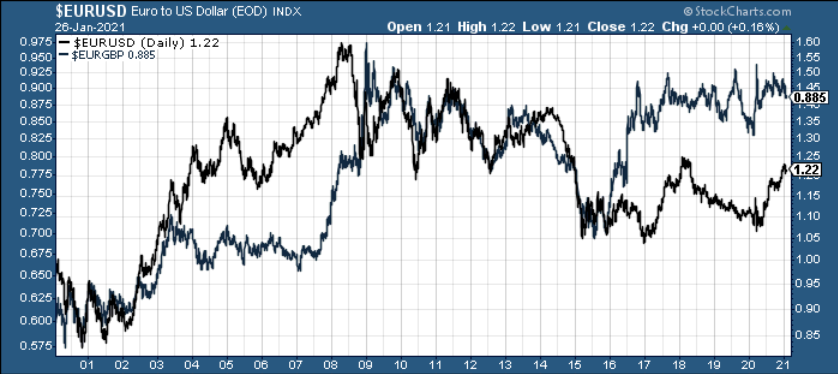
Figure 6
If you analyze the chart above, ~20 years of history shows that the EUR/GBP and the EUR/USD tend to follow in each other’s footsteps. As a result, if the EUR/GBP retests its April low (the next support level), the EUR/USD is likely to tag along for the ride (which implies a move back to ~1.08).
And living up to its billing, the EUR/GBP is racing toward its April low.
Please see below:
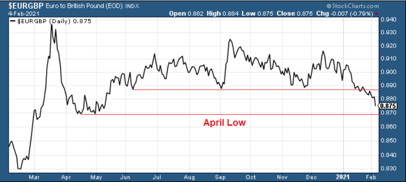
Figure 7
And if the April low breaks, it could be lights out for the EUR/USD. Already, the currency pair has broken below its long-term declining resistance line. And if the technical damage continues and the EUR/USD breaks below the 1.16/1.17 level, its long-term support (roughly 1.05) is well within the range of its April low (roughly 1.08).
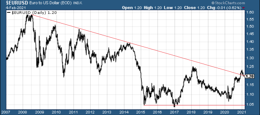
Figure 8
To make the fundamental case for a lower EUR/USD, the U.S. Treasury revealed on Feb. 1 that it plans to borrow $274 billion in the first quarter of 2021. In stark contrast to its November estimate of $1.127 trillion, the massive 76% reduction (the red box below) is the result of stimulus gridlock in Washington.
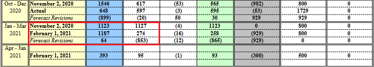
Figure 9 - Source: The U.S. Department of the Treasury
From a currency perspective, the about face is extremely bullish for the U.S. dollar. With the European Central Bank’s (ECB) printing press working 24/7, the FED/ECB ratio has already declined by 0.26% week-over-week. And now, with the U.S. Treasury reducing its Q1 borrowing, the ratio should continue to move lower.
To explain, the U.S. Treasury raises money by selling bonds to the general public. And to keep interest rates low, the FED purchases these bonds on the secondary market. The two claim that they don’t collaborate, however, the end result is always the same: the more bonds the Treasury issues, the more purchases that the FED has to make to keep interest rates low. Conversely, the less bonds the Treasury issues, the less purchases that the FED has to make to keep interest rates low.
As a result, the Treasury’s latest projection adds more wind to the greenback’s sails.
Also supportive of a weaker EUR/USD, the Eurozone economy remains on life support. On Feb. 4, IHS Markit revealed that its Eurozone Productivity PMI fell for a third straight month (to 47.4 in January) and that the latest decline occurred at the quickest pace since June.
Please see below:
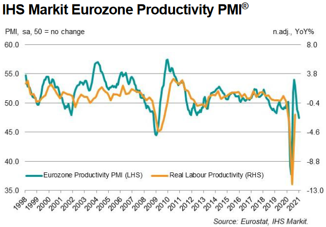
Figure 10
To explain the term, I wrote previously:
PMI (Purchasing Managers’ Index) data is compiled through a monthly survey of executives at more than 400 companies. A PMI above 50 indicates business conditions are expanding, while a PMI below 50 indicates that business conditions are contracting (the scale on the left side of the chart).
Even more insightful, service sectors in France and Italy (Europe’s second and third-largest economies) led the PMI decline, as both countries (figure 15 – the blue boxes below) underperformed the bloc average (figure 15 – the red box below).
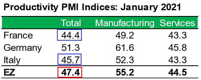
Figure 11 - Source: IHS Markit
To make matters worse, Eurozone construction activity has fallen off a cliff. The IHS Markit Eurozone Construction PMI recorded its sharpest decline since May and an excerpt from the release read:
“The decline in construction output across the Eurozone was driven by falls in each of the three largest economies in the region. France posted the steepest rate of contraction, followed by Germany, with both countries seeing rates of contraction quicken since December. Italy meanwhile recorded a drop in construction activity for the third time in the past four months, albeit one that was only mild.”
But the one saving grace? 12-month confidence in Europe turned positive.
Please see below:
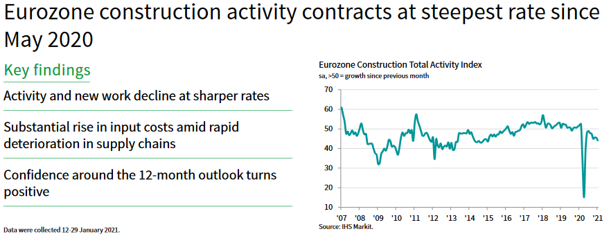
Figure 12
Indicating superficial strength, Eurozone inflation also rose by 0.90% in January (the red box below).
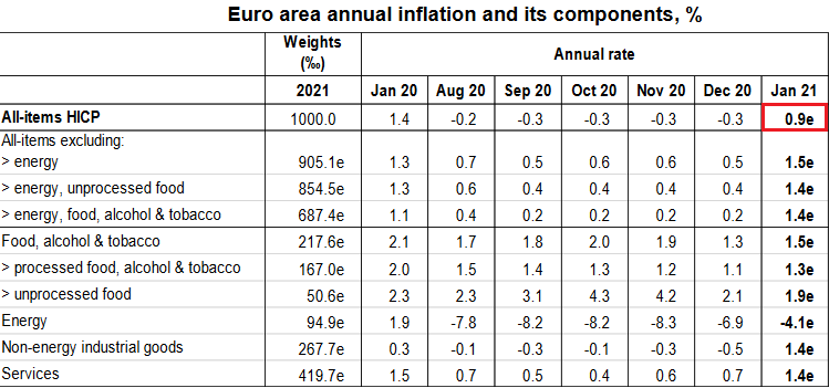
Figure 13 - Source: Eurostat
And while the positive January print ended a streak of seven-straight months of negative inflation, it’s not a cause for celebration. Previously, I wrote that higher inflation is a precursor to higher interest rates; and higher interest rates are a precursor to a stronger currency.
However, in the Eurozone, inflation is rising alongside deteriorating economic fundamentals. If you combine everything above with the fact that the youth unemployment rate (persons under 25) in Europe increased from 18.1% to 18.5% month-over-month in December, the region could be headed for stagflation.
Please see below:
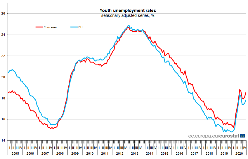
Figure 14
To explain the term, stagflation occurs when a region has high inflation and high unemployment. In a nutshell: it’s the worst possible outcome for an economy, as monetary and/or fiscal easing becomes a double-edged sword.
Further supporting the possibility, the overall Eurozone unemployment rate has barely moved since September. Despite the best efforts of Europe’s governments and central bank, progress has become a slow process.
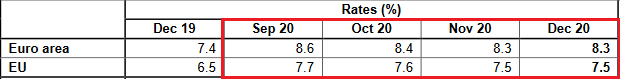
Figure 15 - Source: Eurostat
Conversely, the U.S. unemployment rate has fallen by 1.1 points since September – delivering yet another data point of relative outperformance.
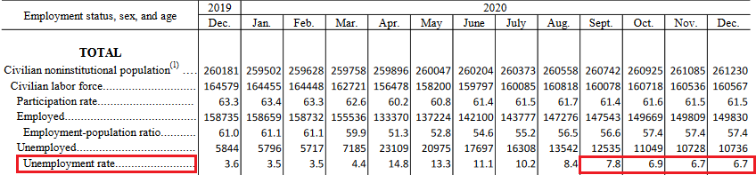
Figure 16 - Source: U.S. Bureau of Labor Statistics (BLS)
In conclusion, the EUR/USD remains destined for devaluation. The Eurozone economy is drastically underperforming the U.S. and market participants are finally starting to accept this reality. As a result, the PMs are likely to remain under pressure. Given their strong correlation with the currency pair, a weaker EUR/USD is likely to drop the hammer on the metals. However, once the technical and fundamental damage is complete, the PMs will shine once again.
Letters to the Editor
Q: You have introduced a glittering array of charts and data to support your macro thesis, which is playing out, albeit in slow motion. I was in wealth management my entire career and I have never seen ANYTHING as comprehensive as what you produce. Not wanting to jump the gun, but I gather that the GDX tends to outperform in the early stages of a recovery and then the GDXJ tends to take over... then silver becomes a later runner. Do you see any reason why the forthcoming recovery will not follow this? To make it simpler... would it be fair to concentrate on gold mining stocks initially and to avoid SILJ in the early months? Finally, have you heard of JGLD? It’s a new PROPER JUNIOR MINING EFT. GDXJ is mainly mid-tier stocks these days. I thought other readers would be interested.
A: It’s great to hear compliments from a professional – thank you!
As far as the relative performance is concerned, the above is indeed what’s often taking place, but I would like to emphasize (for those who might be reading my analysis for the first time today) that this outperformance doesn’t mean a situation where one market stops rallying and then only the other market is moving. No, it means that they all move in the same direction, but one of them is providing a bigger bang for the buck at a given time. Senior miners tend to do that at first (along with junior miners to some extent), then junior miners start to perform a bit better than seniors and silver is often strongest in the final parts of a given rally.
I wouldn’t use the word “avoid” with regard to SILJ in the early months of the next medium-term upswing, as it might imply that it’s bad ETF or one that would trigger losses even though the rest of the precious metals market moves higher. I’d use “prefer” or “use mostly for diversification purposes”. If you look at the SILJ to SIL ratio, you see that after the bottom silver juniors didn’t really lag the silver seniors, initially, but they did outperform about 2 months after the bottom.
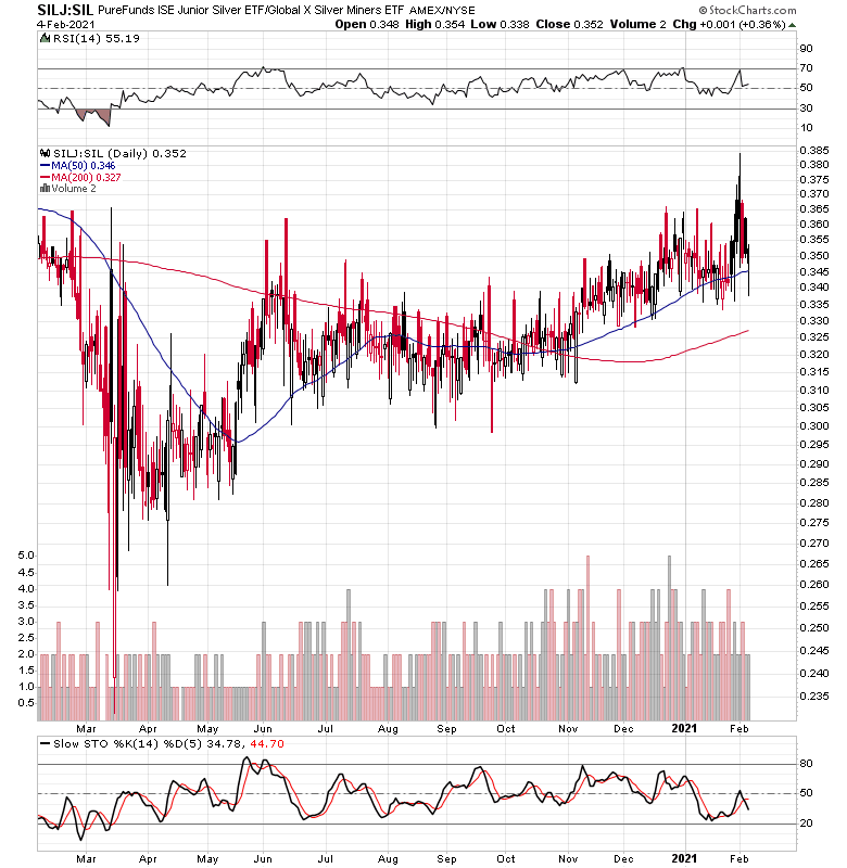
Figure 17
Then again, if one followed the “seniors first, then juniors, and then silver” rule, they would still likely be happy with the results.
As far as JGLD is concerned – thank you for mentioning it. I haven’t previously commented on it. I agree that there are not as many juniors in the GDXJ junior ETF as there should be and that’s its more similar to the GDX than it should, and that the JGLD does solve this problem by having mostly low-cap juniors. However, it seems to me that it’s too early to use this ETF as it was launched only about two months ago and the liquidity in it is still very low. If it increases substantially before the time comes to focus on junior miners (as above), then this might be my unleveraged junior miner ETF of choice. Some people will likely still prefer the leveraged ones, though.
Disclaimer: All essays, research, and information found on the Website represent the analyses and opinions of Mr. Radomski and Sunshine Profits' associates only. As such, it may prove wrong ...
more

