
Monthly M2 Shrinks For The First Time In Over 12 Years
According to the seasonally adjusted data, M2 contracted by $83B in April. The Money Supply analysis last month highlighted the slowing money supply growth rate, but this is the first contraction seen since January 2010.
The economy and stock market have been built on massive stimulus and liquidity from a rapidly expanding money supply. With M2 growth decelerating last month, the stock market looked in trouble. Now that it has become a contraction, the effect could be very profound.
(Click on image to enlarge)
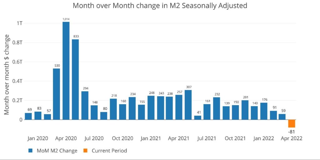
Figure: 1 MoM M2 Change (Seasonally Adjusted)
In his latest podcast, Peter Schiff discusses that the Fed must shrink the money supply to get inflation under control. The problem for the Fed is that even this small contraction has resulted in a bear market for the Nasdaq, Russel 2000, and almost the S&P. Furthermore, mortgage rates have reached 5.5% creating problems in the housing market.
Looking at the chart above, imagine undoing all the stimulus since Covid and consider the impact on the economy. If the small $81B contractions have caused this much pain, undoing all the M2 growth would be catastrophic.
The chart below shows the non-seasonally adjusted money supply. The current slowdown can be seen very clearly when compared to the growth since Covid. The market is not used to this and hence everything is slowing.
(Click on image to enlarge)
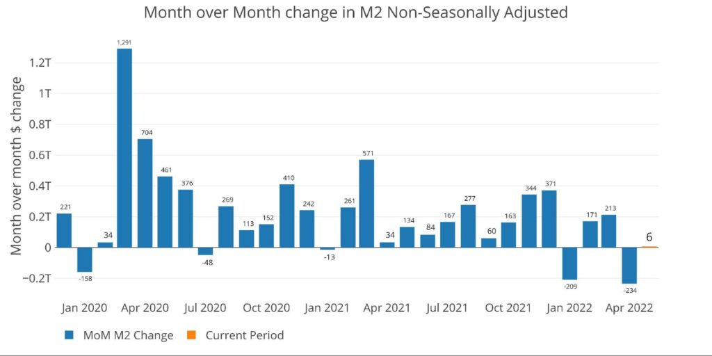
Figure: 2 MoM M2 Change (Non-Seasonally Adjusted)
The table below shows this slowdown more clearly. Over the past three years, M2 growth has averaged 14.3% annualized. In the past year, that has fallen to 8%, dipping to 5.6% over the last 6 months, and turning negative in the most recent month. This is a dramatic slowdown.
(Click on image to enlarge)
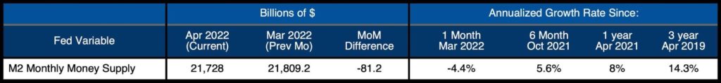
Figure: 3 M2 Growth Rates
When looking at the average monthly growth rate by month before Covid, April historically expands at an annualized 5.4%. This compares to -4.4% for the current month.
(Click on image to enlarge)
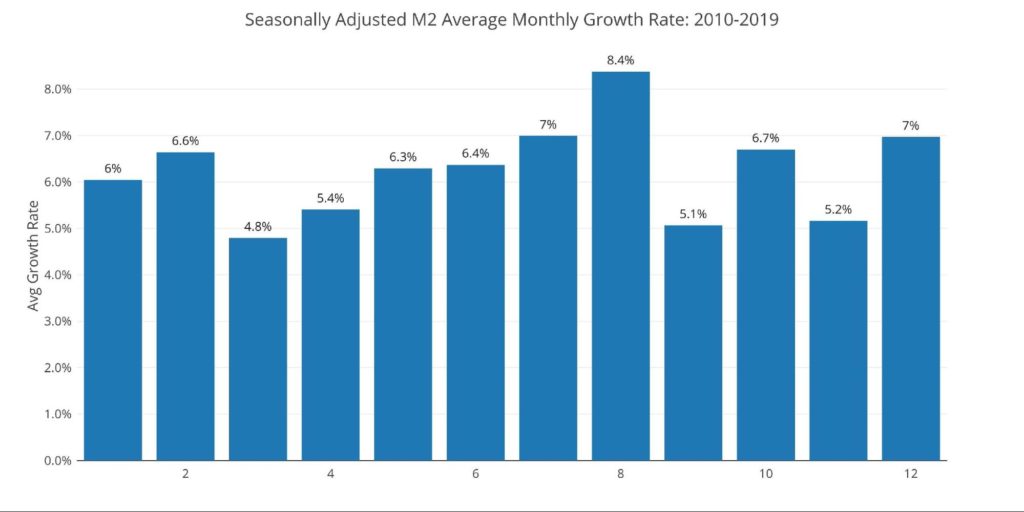
Figure: 4 Average Monthly Growth Rates
The Fed only offers weekly data that is not seasonally adjusted. The chart below shows how the week ending April 25th saw M2 drop by $446B! This is greater than the largest increase which occurred on March 30, 2020, when Money Supply grew by $421.7B.
(Click on image to enlarge)
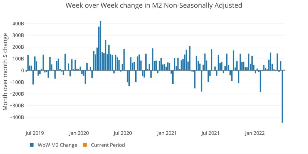
Figure: 5 WoW M2 Change
The “Wenzel” 13-week Money Supply
The late Robert Wenzel of Economic Policy Journal used a modified calculation to track Money Supply. He used a trailing 13-week average growth rate annualized as defined in his book The Fed Flunks. He specifically used the weekly data that was not seasonally adjusted. His analogy was that in order to know what to wear outside, he wants to know the current weather, not temperatures that have been averaged throughout the year.
The objective of the 13-week average is to smooth some of the choppy data without bringing in too much history that could blind someone from seeing what’s in front of them. The 13-week average growth rate can be seen in the table below. Decelerating trends are in red and accelerating trends in green. Money Supply growth on a 13-week annualized basis was mostly accelerating for 16 weeks in a row. It has now been flat or down for 16 weeks in a row.
Growth has now reached 5.37% which is the lowest reading in more than 60 weeks.
(Click on image to enlarge)

(Click on image to enlarge)
![]()
(Click on image to enlarge)
![]()
Figure: 6 WoW Trailing 13-week Average Money Supply Growth
The plot below helps show the seasonality of the Money Supply and compares the current year to previous years. It shows the current trajectory moving down quite steeply. In the last two years, this has rebounded in April with stimulus, but the Fed is now tightening conditions which are pushing the growth rate even lower.
While the growth rate looks to be returning to pre-Covid levels, it must be considered against the backdrop of the massive stimulus over the last two years. To reiterate, the market is conditioned to massive Money Supply growth to keep pushing the “everything bubble” higher. Without this continued acceleration, it is very likely the bubble will deflate.
(Click on image to enlarge)
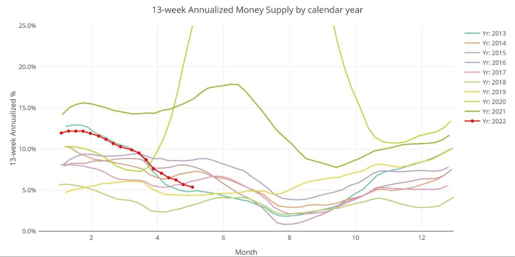
Figure: 7 Yearly 13-week Overlay
Behind the Inflation Curve
The problem is that this deceleration will not do enough to slow inflation but it will certainly be enough to crash the bubble. To combat rising prices, the Fed would need to undo all the money it has created over the last several years. This would require bringing interest rates above the rate of inflation.
Unfortunately, the chart below shows that the Fed has never been further behind the inflation curve. A recession on its own will not cure this inflation problem because of the lagged effects. Looking at the period of 1970, inflation always moved higher on a delay after significant expansion in the money supply. Price increases are still waiting to feel the full effects of all the M2 growth. Furthermore, history shows it required rates higher than inflation to bring prices back down.
(Click on image to enlarge)
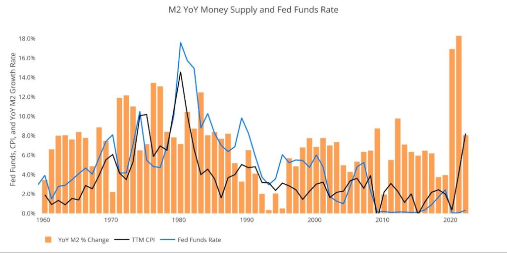
Figure: 8 YoY M2 Change with CPI and Fed Funds
Historical Perspective
The charts below are designed to put the current trends into a historical perspective. The orange bars represent annualized percentage change rather than the raw dollar amount. The current contraction can be seen against more than 12 years of non-stop expansion.
If one month of M2 contraction can cause this much pain, how much carnage would unfold in a prolonged fight against inflation where M2 had to shrink consistently for months?
(Click on image to enlarge)
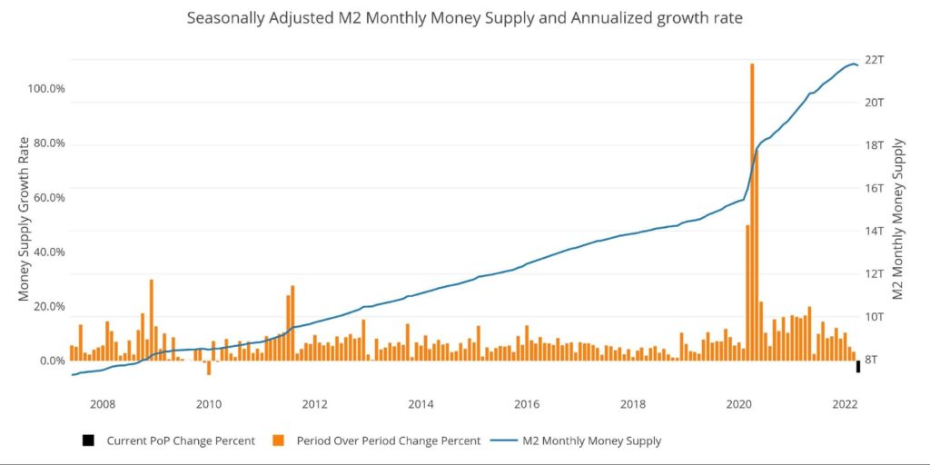
Figure: 9 M2 with Growth Rate
Taking a historical look at the 13-week annualized average also shows the current predicament. This chart overlays the log return of the S&P. Mr. Wenzel proposed that large drops in Money Supply could be a sign of stock market pullbacks. The current value of 5.4% is the lowest value since July 2019.
His theory, derived from Murray Rothbard, states that when the market experiences a shrinking growth rate of Money Supply (or even negative) it can create liquidity issues in the stock market, leading to a sell-off. While not a perfect predictive tool, many of the dips in Money Supply precede market dips. Specifically, the major dips in 2002 and 2008 from 10% down to 0%.
The latest stock market pullback is further evidence of this relationship. Based on the chart below, history would indicate that the market pullback is just getting started.
Please note the chart only shows market data through May 2 to align with available M2 data.
(Click on image to enlarge)
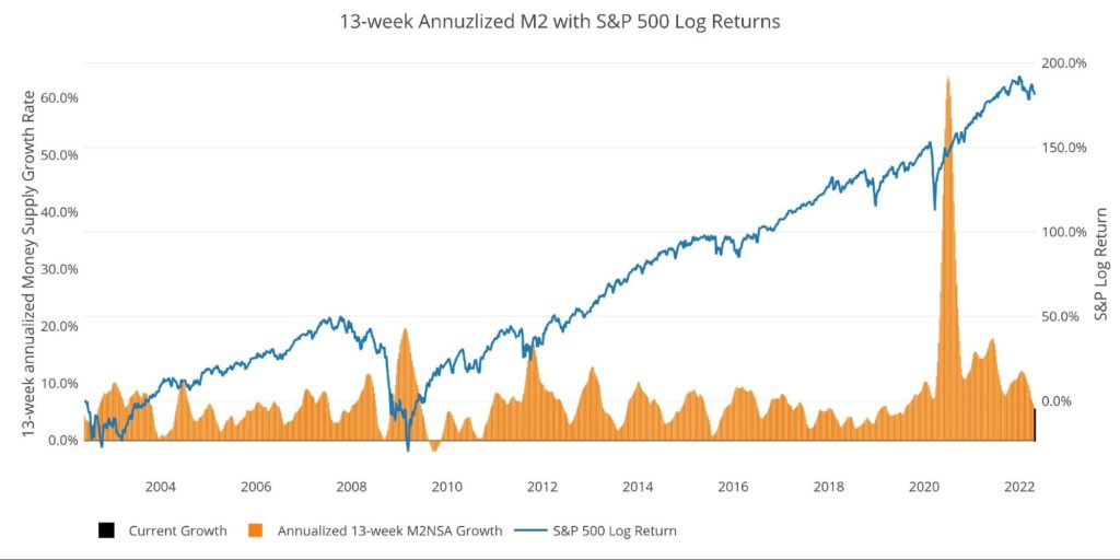
Figure: 10 13-week M2 Annualized and S&P 500
One other consideration is the massive liquidity buildup in the system. The Fed offers Reverse Repurchase Agreements (reverse repos). Essentially this is a tool that allows financial institutions to swap cash for instruments on the Fed balance sheet.
Current Reverse Repo exceeded $2T on May 23 for the first time in history. This dwarfs the old records of ~$500B in 2016-2017 and quarter-end is still more than a month away when Repos tend to peak.
This shows that even though M2 has contracted there are still trillions of dollars in liquidity sloshing around. How will prices drop with this much excess liquidity in the system?
(Click on image to enlarge)
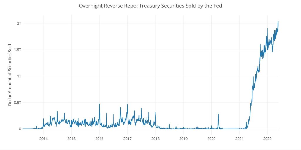
Figure: 11 Fed Reverse Repurchase Agreements
What it means for Gold and Silver
Inflation is an expansion of the Money Supply that generally leads to higher prices. To bring prices back down, Money Supply has to contract. So far, the market has experienced a single month of contraction and it has ripped through financial markets.
Money Supply growth rates do not typically bottom until August. If the contraction in M2 continues for another 3 months, then it will bring nearly everything into a vicious bear market. The Fed cannot allow this to happen. The recent surge in tax revenues would most likely reverse, putting extraordinary strain on the Federal budget. Not to mention the massacre that would unfold in the stock and real estate market.
Expect the Fed to see 1-2 months of slightly lower inflation (though well above 2%), proclaim victory prematurely, and “rescue” the economy with more stimulus. This could be the moment where gold and silver take off and put $2000 and $30 well in the rearview mirror.
Data Source: https://fred.stlouisfed.org/series/M2SL and also series WM2NS and RRPONTSYD. Historical data changes over time so numbers of future articles may not match exactly. M1 is not used because the calculation was recently changed and backdated to March 2020, distorting the graph.
Data Updated: Monthly on fourth Tuesday of the month on 3-week lag
Most recent data: May 02, 2022
Interactive charts and graphs can always be found on the Exploring Finance dashboard here


